The Eventify event website builder lets you create a public site for your conference or expo by dragging ready-made blocks onto a canvas, with no coding needed.
⚠️ Early beta: The Website Builder is currently in early beta. Some features are still being polished and occasional glitches are expected. If something doesn’t behave as described here, refresh and try again, or contact support — and thanks for your patience while we improve it.
This article introduces the Website Builder, shows you how to open the editor, and gives you a tour of the workspace so you know where everything lives.
What is the Website Builder?
The Website Builder is a visual editor for creating a public website for your event — a conference, expo, summit, or similar. You build pages by dragging ready‑made blocks (headers, hero sections, feature grids, footers, and more) onto a canvas and editing them directly, the way they'll appear to visitors.
What you can build:
A multi‑page website with your own pages and navigation.
Fully styled sections using pre‑designed templates you can customize.
Live event sections — agenda, speakers, sponsors, exhibitors, news, and a countdown — that pull real data from your event.
A responsive site that adapts to desktop, tablet, and mobile automatically.
A published site on an Eventify address (for example your-event.eventify.io) or your own custom domain.
No coding knowledge is required, though advanced users can inject custom code if they wish (see Site Settings & Publishing).
Opening the editor & creating your first website
The Website Builder opens from your event's admin dashboard.
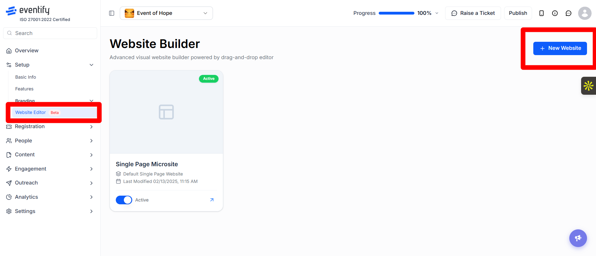
In the admin dashboard, go to Setup > Website Editor. The Website Builder page lists your websites.
To create a new site, click New Website. You'll be asked to pick a starter template (for example an Expo, Healthcare, or Summit theme). Choose the one closest to the look you want — you can change everything later.
The editor opens. Your site loads with its pages, and the first page appears on the canvas ready to edit.
Tip: The starter template only sets your starting point. Every color, font, section, and word can be changed afterward, so don't worry about picking the "perfect" one.
Manage your websites
The Website Builder page shows each website as a card. The first card is always the default Single Page Microsite.
Active switch: only one website can be active at a time. Turning a website on makes it the active site and turns the others off. If you turn all websites off, your event falls back to the default Single Page Microsite.
Status: the active website shows an Active badge; all other websites show Draft.
Edit Site: hover over a website card and click Edit Site to open it in the editor.
Duplicate: open the three-dot menu on a card and click Duplicate to make a copy of that website.
Delete: open the three-dot menu and click Delete, then confirm. Once deleted, all your customizations for that website are lost and this cannot be undone.
The Single Page Microsite card only has the Active switch and a preview; it cannot be edited, duplicated or deleted here.
#image# Website Builder page with website cards showing Active and Draft status, the Active switch and the three-dot menu
The editor interface explained
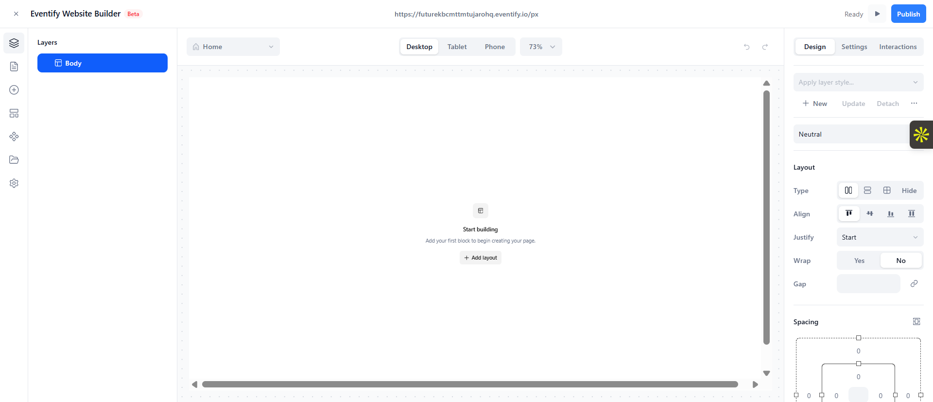
The editor has three main areas plus a top bar. Getting familiar with these makes everything else easier.
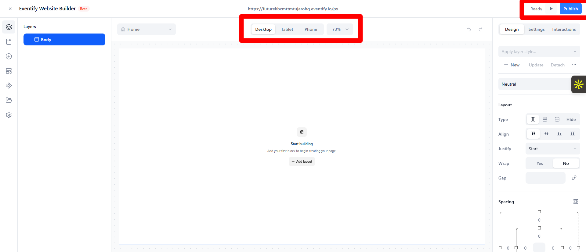
1. The top bar
Runs across the top of the screen and holds your global controls:
Save status — shows Saving… / Saved / Unsaved so you always know whether your work is stored. (Your work also autosaves — see Saving, autosave & version history.)
Device / viewport switcher — toggle between desktop, tablet, and mobile views. See Responsive design.
Preview — switch into a read‑only preview to see the site as a visitor would. See Previewing your site.
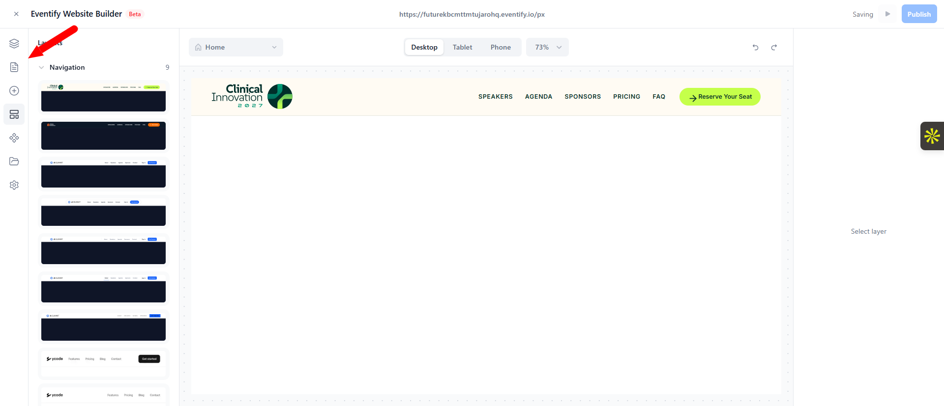
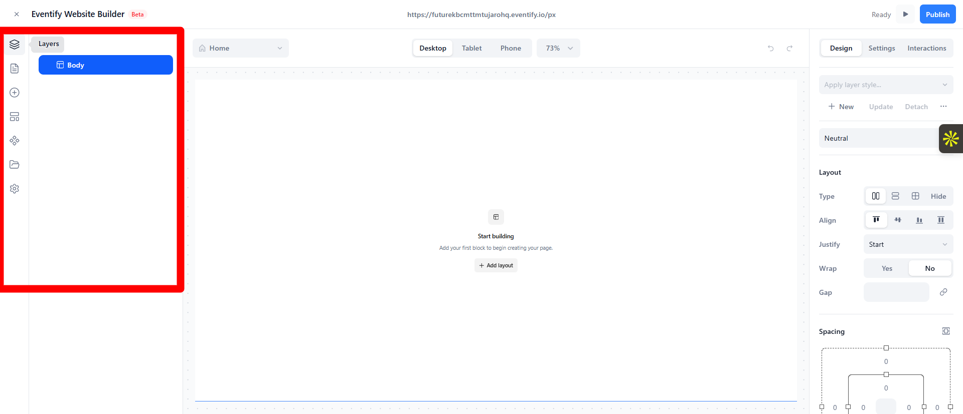
Pages — the list of all pages in your site (with folders). Add, rename, delete, and reorder pages here. See Pages & Navigation.
Elements — the block/element library. Drag sections and individual elements onto the canvas. See Adding blocks & sections.
Assets — your uploaded images and media library.
Components — reusable blocks you've saved to use across pages.
Settings (gear icon) — global site settings such as site name, theme color, fonts, custom code, and domains. See Site Settings & Publishing.
3. The center canvas
The large area in the middle is where your page is shown and edited. You interact with it directly:
Click an element to select it (its styling options appear in the right panel).
Double‑click text to edit it in place.
Use the zoom controls to zoom in/out or fit the page to your screen.
4. The right properties panel
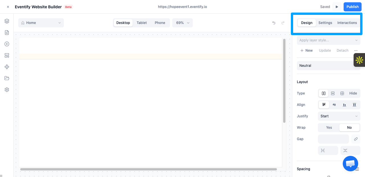
When you select an element, its options appear here, organized into tabs:
Design — visual styling: typography, spacing, sizing, layout, background, borders, effects, and more. See Styling elements.
Settings — options specific to the selected element (for example an image's source and alt text, or an agenda block's variant and display options).
Interactions — hover states and animations.
The core workflow: pick a page → drag in blocks → click an element and edit its text/style → preview → publish. The rest of this knowledge base walks through each step in detail.
Frequently Asked Questions
Do I need coding skills to use the Website Builder?
No. You build pages by dragging blocks and editing them directly. Custom code is optional for advanced users.
Can I change the starter template later?
Yes. The template only sets your starting point. Every color, font, section and word can be changed afterward.
Can I have more than one website active for my event?
No. Only one website can be active at a time. Turning one on turns the others off, and if none are active your event uses the default Single Page Microsite.
How do I copy an existing event website?
In Setup > Website Editor, open the three-dot menu on the website card and click Duplicate.

.png)