
This guide covers how to build a page in the Eventify event website builder by adding blocks, editing text, inserting images and media, and linking buttons.
⚠️ Early beta: The Website Builder is currently in early beta. Some features are still being polished and occasional glitches are expected. If something doesn’t behave as described here, refresh and try again, or contact support — and thanks for your patience while we improve it.
Pages are built from blocks and elements. This article covers adding sections, the types of elements available, arranging and deleting them, and editing their content — text, images, media, and links.
Open the Elements panel from the left sidebar. It has two ways to add content:
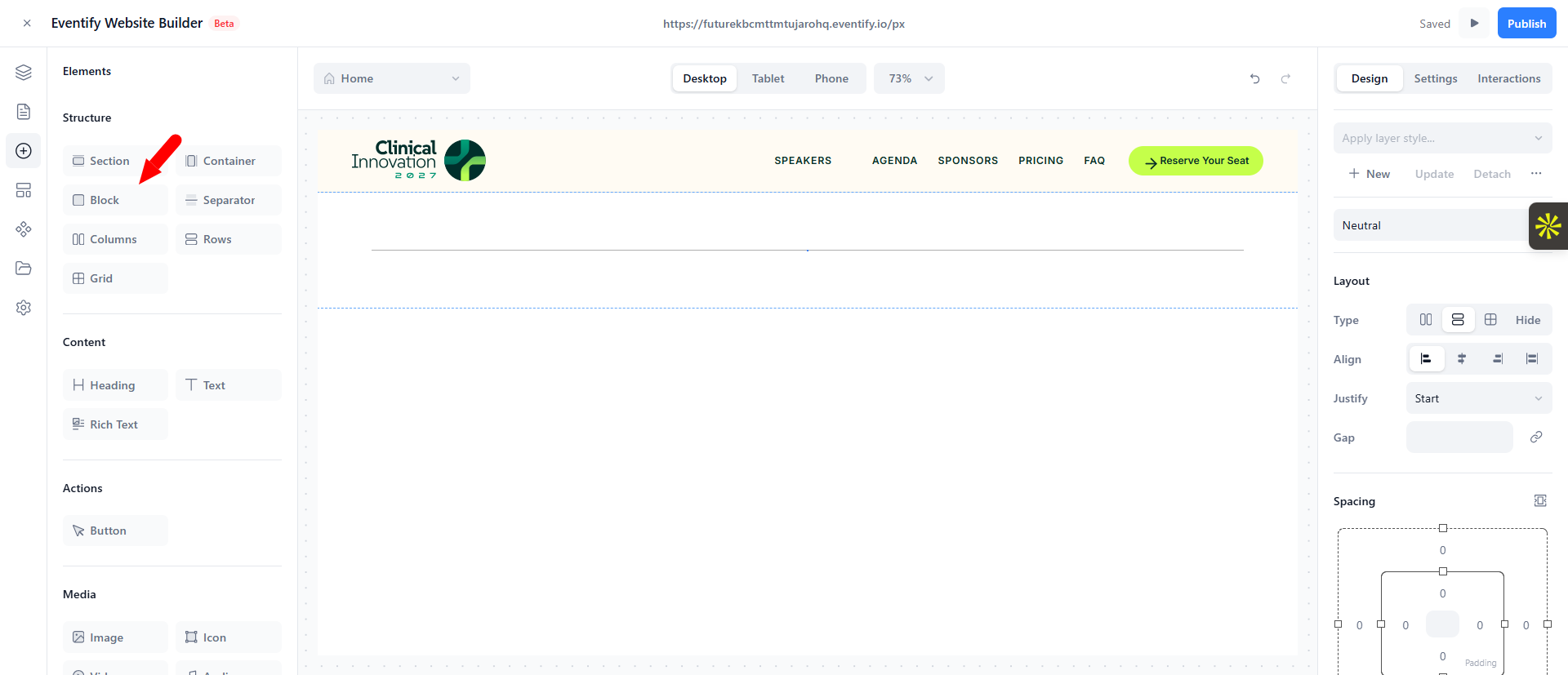
Tip: Start with a Layout section for structure, then select the individual elements inside it to customize the text, images, and styling.
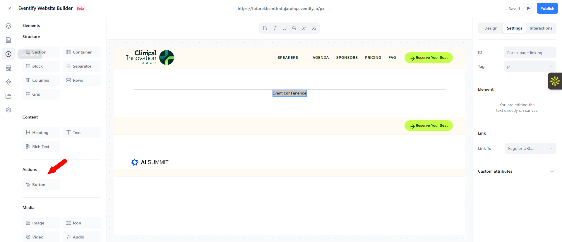
From the Elements tab you can add:
section, container, div, columns, rows, grid, dividers (hr), and tables. These hold and arrange other elements.heading and text.button.image, icon, video, audio.form and fields: input, textarea, select, checkbox, radio, label, and filters.map, lightbox, and sliders/carousels (slider, slides).For sections that display your event's live data (agenda, speakers, sponsors, exhibitors, news, countdown), see Dynamic Event Content.
Every element on the page lives in a tree (blocks can contain other blocks). You manage that structure in the Layers view.
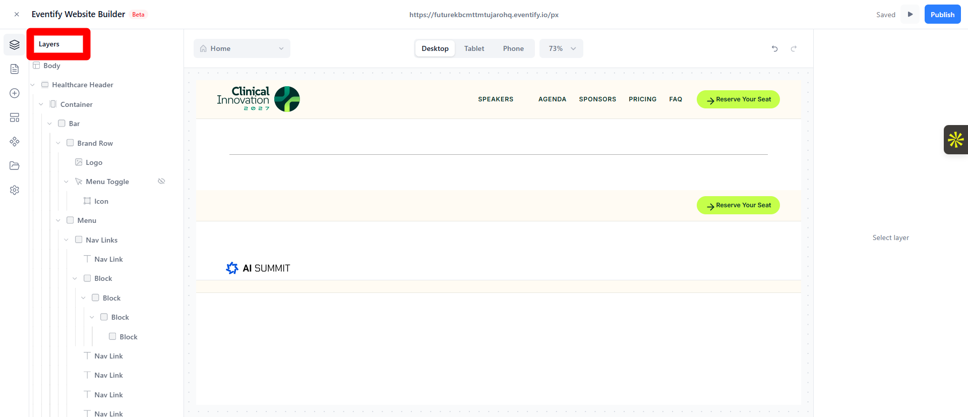
Tip: Selecting elements in the Layers tree is often easier than clicking on the canvas, especially for containers that sit behind other elements.
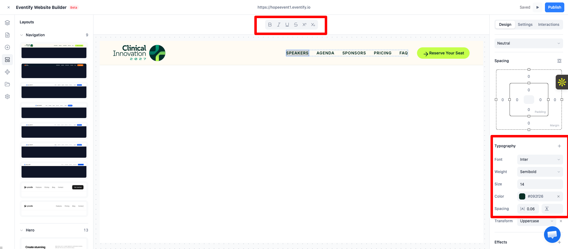
To change the font, size, color, weight, spacing, or alignment of a whole text element, select it (single click) and use the Design → Typography controls in the right panel. See Styling elements.
Editing text changes only its wording and inline formatting. It doesn't change where a menu link points — the underlying page link stays intact. See Adding navigation links to your header.
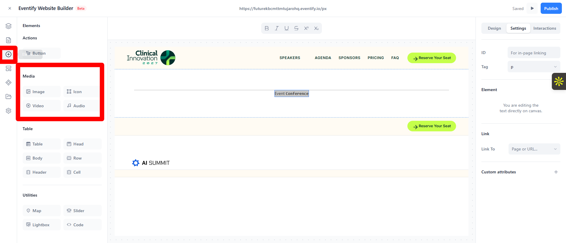
Add a video or audio element from Elements → Media, then use its Settings tab to set the source and playback options (autoplay, loop, mute, controls).
Buttons and links send visitors somewhere. Select a button (or a linkable text element) and open the Link section in the right panel.
You can link to:
mailto:).tel:).Behavior options:
To change a button's label, double‑click it and type. To change its appearance (color, size, padding, corners), use the Design tab — see Styling & Design.
Yes. In an image's Settings tab you can upload a file, pick from your Assets library, or search stock photos from Pexels.
A page on your site, an external URL, a section anchor, an email address, a phone number, or a downloadable asset.
