
This guide shows how to style your event website in the Eventify Website Builder, including element design, colors, mobile and tablet layouts, and site-wide theme settings.
⚠️ Early beta: The Website Builder is currently in early beta. Some features are still being polished and occasional glitches are expected. If something doesn’t behave as described here, refresh and try again, or contact support — and thanks for your patience while we improve it.
Make your site look the way you want. This article covers styling individual elements, working with colors and fonts, making your site responsive across devices, and setting a site‑wide theme.
Select any element on the canvas, then open the Design tab in the right panel. Options are grouped into sections you can expand and collapse:
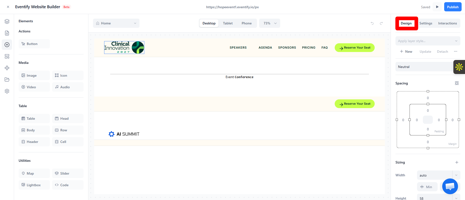
Tip: You don't need to touch every section. Most styling day‑to‑day is typography, spacing, and backgrounds. Start there.
Anywhere you set a color (text, background, border), you get the color picker:
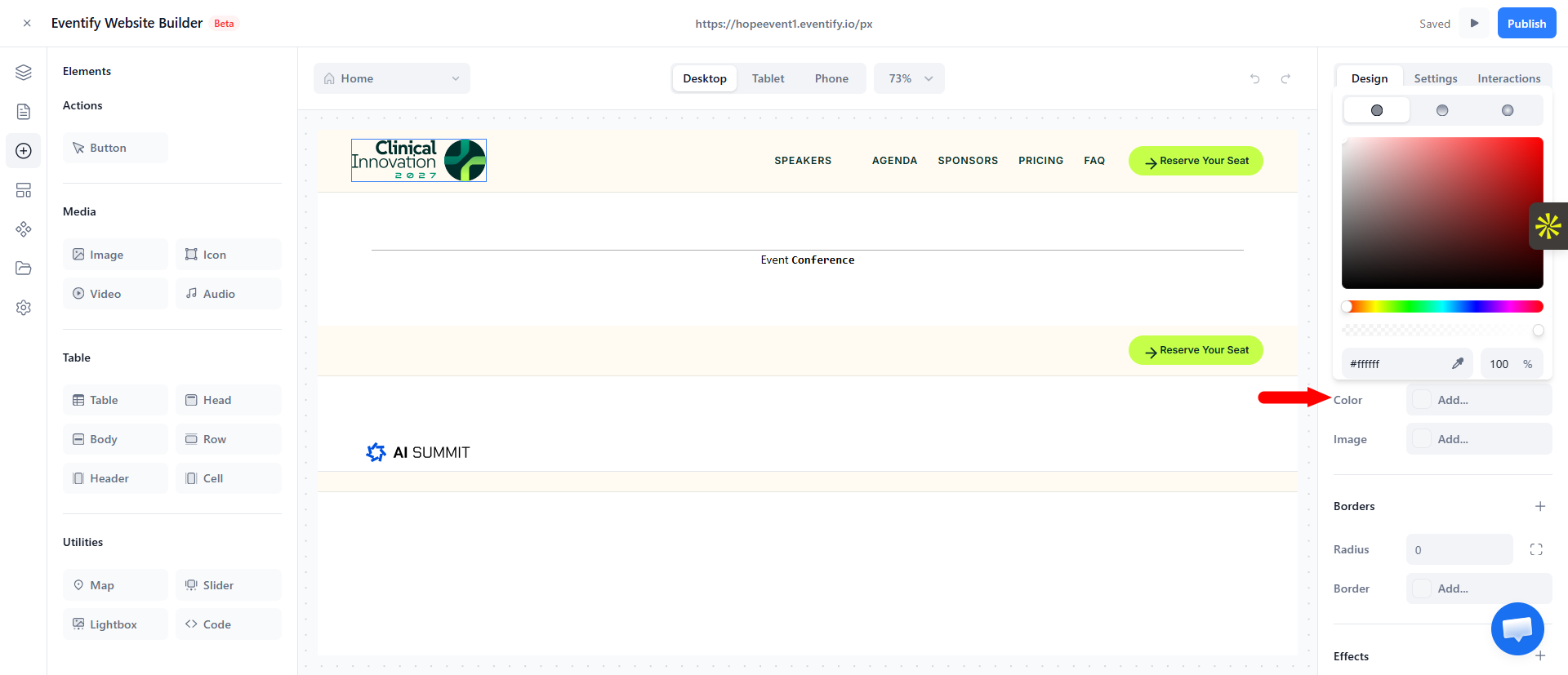
Tip: For a consistent look, base your colors on your theme color (set in Global theme settings). Reusing the same few colors across the site looks far more polished than many one‑off shades.
Your site automatically adapts to different screen sizes, and you can fine‑tune how it looks on each.
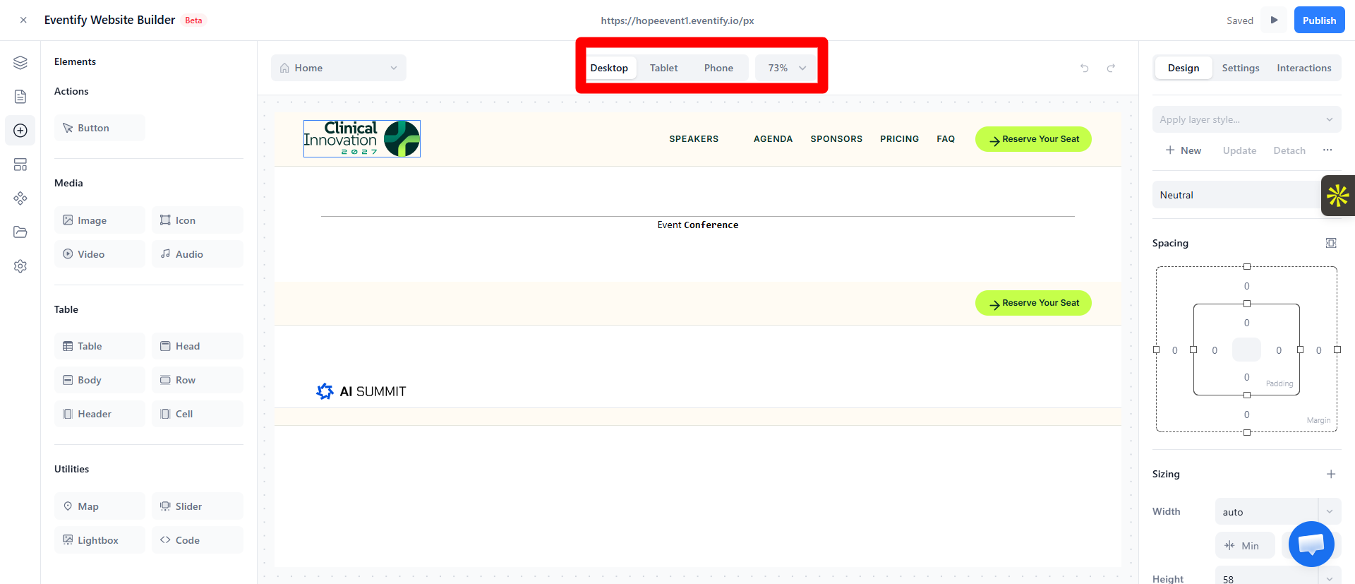
How overrides work: Desktop is your base. Changes made in Tablet or Mobile apply to that size and smaller, and override the base for those screens. Changes you make in Desktop cascade to all sizes unless a smaller view overrides them.
Tip: Build and finalize your Desktop layout first, then switch to Tablet and Mobile to tidy up spacing, font sizes, and stacking. Always preview on mobile — most event‑site visitors are on their phones.
Instead of styling every element by hand, set site‑wide defaults once. Open Settings (the gear icon in the left sidebar) and go to the styling section
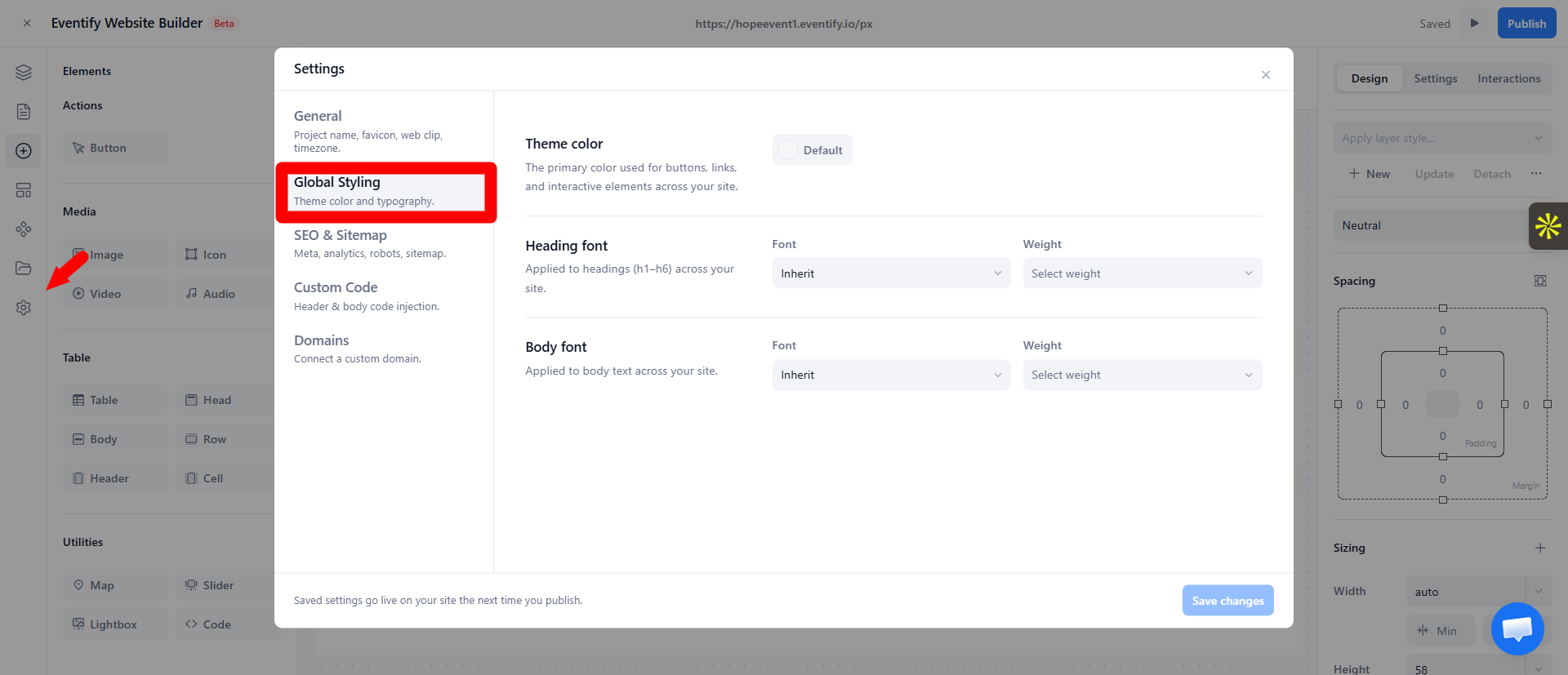
Changes here update your whole site at once and preview live in the editor. Google Fonts are supported in the font picker.
Tip: Set your theme color and fonts before you fine‑tune individual elements. Getting the global look right first means far less manual styling later.
Open Settings (the gear icon) and use the styling section to set the theme color, heading font and body font. Changes apply to the whole site at once.
No. Changes made in Tablet or Mobile view apply to that size and smaller only. Desktop is the base that cascades to all sizes.
