

"Successful event organisation is fundamentally about systems. Attendees only see the surface. They aren't meant to experience the chaos of it all."
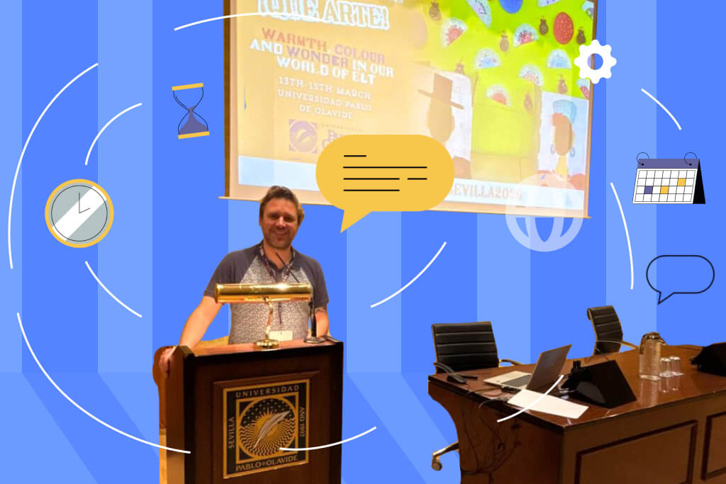
I've been organising TESOL-Spain's annual convention for a number of years now. It's a national conference for English language teachers across Spain - a nonprofit, volunteer-run event that moves to a different city every year. We see around 400 to 500 attendees across three days, manage roughly 90 speakers, and do it all without a professional events team behind us.
What I've learned has less to do with the event itself and more to do with everything that happens before it. Every edition has taught me something - and almost all of it comes down to one thing:
The quality of your pre-event systems determines the quality of your event day.
Here's the checklist I keep coming back to. You can also read the full TESOL-Spain case study here.
You Can't Collect the Right Information If You Don't Know What You Need
The biggest mistake I made early on was collecting information reactively - chasing speakers for bios, following up with attendees about dietary requirements, sifting through email chains to find a sponsor's logo. It costs hours, and it compounds.
The shift came when I started asking a different question before building any form: what do I actually need, and from whom?
For TESOL-Spain, the answer looked like this:
Speaker forms collect:
- Full bio and headshot
- Session title and description
- AV and technical requirements
- Presentation format
Attendee forms collect:
- Registration and check-in details
- Session preferences
- Everything needed for a smooth on-site experience
Sponsor forms are completely separate - different information, different timeline, different follow-up.
Each group only sees what's relevant to them. No overlap. No confusion.
💡 Quick win: Make every critical field mandatory. If the information is required before the form can be submitted, you don't have to chase it later. This one change alone eliminates an entire category of follow-up emails.
💡Points for Planners
- Map out your data needs per audience group before opening a single form
- Build separate forms for speakers, attendees, and sponsors
- Required fields are not optional - make them non-negotiable from the start
The Right Message Needs to Reach the Right Person
One of the most underrated pre-event steps is getting your audience categories right. When everyone is in the same communication bucket:
- The wrong people get irrelevant updates
- The right people miss critical information
- Your team spends hours untangling threads that should never have crossed
Once we separated our communication workflows for speakers, attendees, and sponsors, the noise dropped immediately. The right update went to the right cohort, every time - no duplicates, no oversights.
💡Points for Planners
- Categorise before you communicate - always
- Separate workflows for speakers, sponsors, and attendees is not extra work, it prevents rework
- Think about what each group actually needs to hear, and when
Stop Letting Data Live in a Spreadsheet
Structured forms are only useful if the data actually makes it into your event platform. We moved to Google Forms for collection, CSV exports, and direct uploads into Eventify. What used to take hours of manual admin became a task anyone on the team could handle in minutes.
We also gave speakers direct access to the Eventify speaker panel to upload and manage their own details. This was a quiet but significant change:
- Before: Bio corrections and session edits bouncing back and forth over email
- After: Speakers manage their own information, the team spends less time chasing, and the data is more accurate because it comes straight from the source
💡Points for Planners
- Connect your data collection directly to your event platform - don't let it sit in a spreadsheet
- Give speakers ownership of their own details wherever possible
- Delegate data uploads - with the right system, this doesn't need to sit with the organiser
Not Everyone Is Comfortable With Technology - And That's Fine
Our attendees are a mix. Younger teachers who adopt new tools immediately, and longer-serving members who still prefer a printed programme and a physical name badge. Both matter equally.
This shaped how we built the entire digital experience:
- If something felt confusing during testing, we redesigned it - no exceptions
- Attendees got app access at least two weeks before the event, so they could explore at their own pace
- The community section opened early, so people could connect before they arrived
By the time attendees walk into the opening ceremony, many of them have already introduced themselves and joined interest threads. It completely changes the feel of those first few hours - people arrive at the welcome event already recognising names and faces, even if they've never met in person before.
💡Points for Planners
- Early app access changes the attendee experience before the event even starts
- If the UI feels confusing to one person, it probably confuses more - redesign it
- Build community features into your pre-event plan, not just your on-site one
Get a Fresh Pair of Eyes - Always
After weeks of building out a schedule, uploading speaker details, and configuring the app, you stop seeing it clearly. Everything looks fine because you know what it's supposed to say.
Before going live, we ask someone completely outside the organising team to walk through the entire attendee experience:
- Can they find a session?
- Is the room information clear?
- Can they locate sponsor details?
- Does the schedule make sense at a glance?
A fresh pair of eyes consistently catches what multiple internal reviews miss. It takes an hour, and it's become a step we wouldn't skip.
💡Points for Planners
- Never self-certify your own event app - get someone outside the team to test it
- Build the review step into your timeline, not as an afterthought
- Check schedules, room info, and sponsor visibility specifically - these are the most common gaps
Last-Minute Changes Are Inevitable - Your Response Doesn't Have to Be Chaotic
With 90 speakers across three days, something always changes. A room swap, a time change, a speaker cancellation the morning of. You can't prevent it.
What you can control is how fast you communicate it.
Static PDF programmes become outdated the moment anything shifts. We moved away from them entirely. Now, when something changes, a push notification goes out immediately - updated information, a map link if needed, no confusion about which version is current.
A few years ago, at our event in Madrid, we sent a Google Maps link to around 500 attendees as a push notification, fifteen minutes ahead of a cocktail event. Walking over myself, I could see people around me with the app open, following the map to the venue. It's a simple feature, but it made something that could have been chaotic feel completely straightforward.
💡Points for Planners
- Retire static PDF programmes - they're outdated the moment something changes
- Have a push notification plan ready before event day, not during it
- A 15-minute heads-up sent to 500 people simultaneously is only possible if your system is already set up
Give People Room to Breathe and They'll Give You More
Pre-event planning isn't just logistics. It's experience design.
Back-to-back sessions with no breathing room drain even the most enthusiastic attendees. We made deliberate changes to how we built the timetable:
- Breaks are planned, not squeezed in
- Popular sessions are spaced to reduce overload
- Time between sessions allows for real conversation
People come back to sessions with more energy. Conversations happen in corridors. The event feels like something worth attending - not just something to get through.
"Pre-event preparation was the biggest stress reducer."
💡Points for Planners
- Treat the schedule as an experience, not just a timetable
- Build in breaks deliberately - they are not wasted time
- Think about attendee energy across the full day, not session by session
Consistency Across Every Touchpoint Signals Professionalism
From the white-labelled app carrying TESOL-Spain's logo to the way every session listing is formatted - consistency matters more than most organisers realise.
When everything looks and reads the same way, the event feels considered. Attendees notice it, even if they can't name why. It signals that someone put real thought into this.
💡Points for Planners
- Use white-labelling if your platform offers it - your event should look like yours
- Format every session listing the same way, without exception
- Branding consistency is not a nice-to-have, it's part of the attendee experience
Don't Go Quiet When the Event Ends
The post-event silence is a missed opportunity. After three days together, attendees want to feel like the experience hasn't just ended and been forgotten.
We close the loop with a Google Form satisfaction survey - it gives people a way to share feedback, helps us improve the next edition, and shows attendees that their experience actually mattered.
💡Points for Planners
- Send a post-event survey within 48 hours while the experience is still fresh
- Keep it short - people are more likely to complete it
- Use the responses to build next year's pre-event checklist
The attendees at TESOL-Spain see a conference. What they don't see is the months of forms, uploads, redesigns, and systems working quietly behind it. That's exactly how it should be. Read the full TESOL-Spain case study here.

.png)