Managing an event involves dozens of decisions, hundreds of details, and very little time for friction. That's why we've completely refreshed the Eventify admin panel — redesigning the interface across every major section to make event management faster, more intuitive, and less cluttered. Whether you're setting up an event for the first time or running your hundredth, the new UI puts everything you need exactly where you'd expect it.
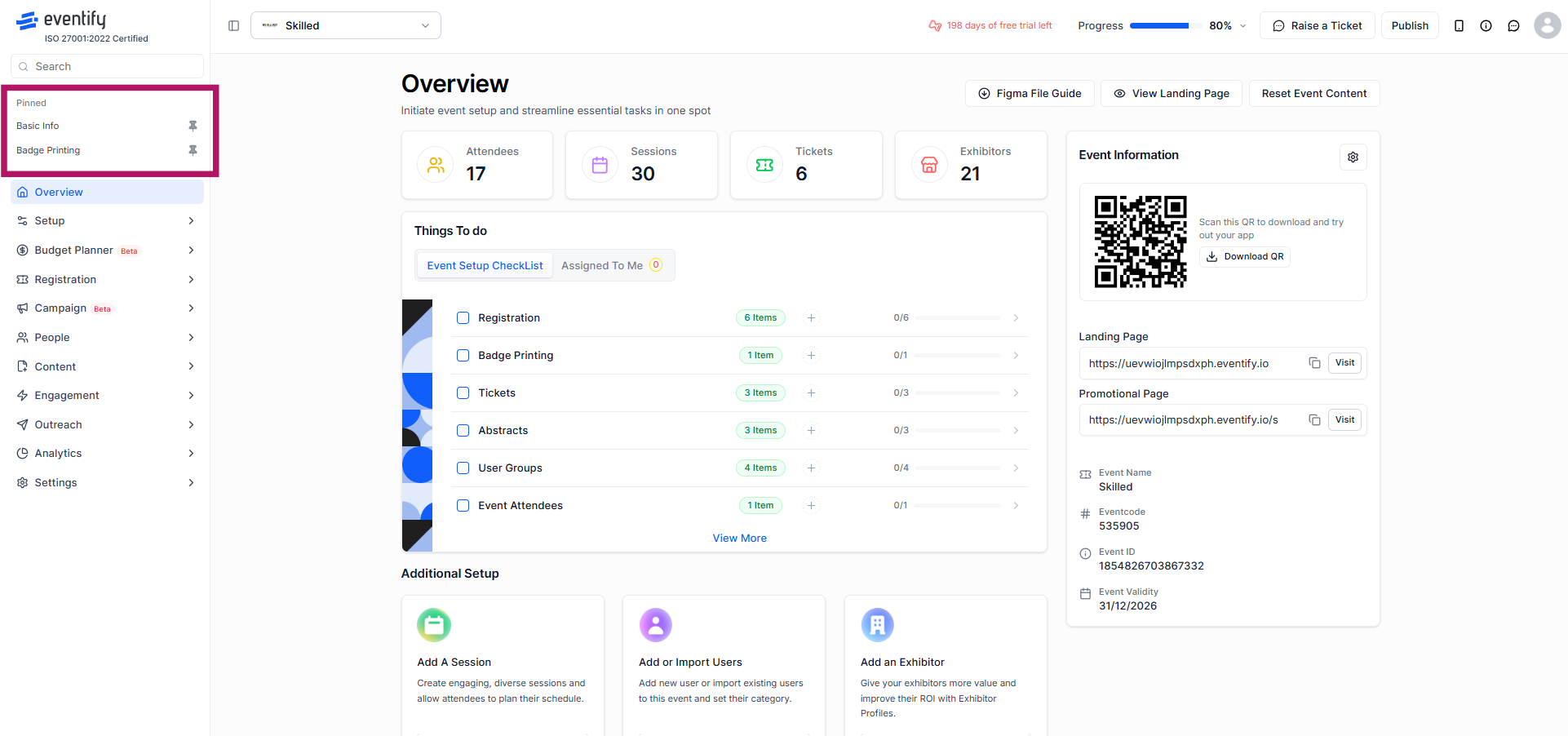
Switching between events used to mean navigating away from what you were doing. The new event dropdown in the header lets you jump between events from any screen, without losing your place. The dropdown is always visible, always accessible, and keeps your workflow moving.

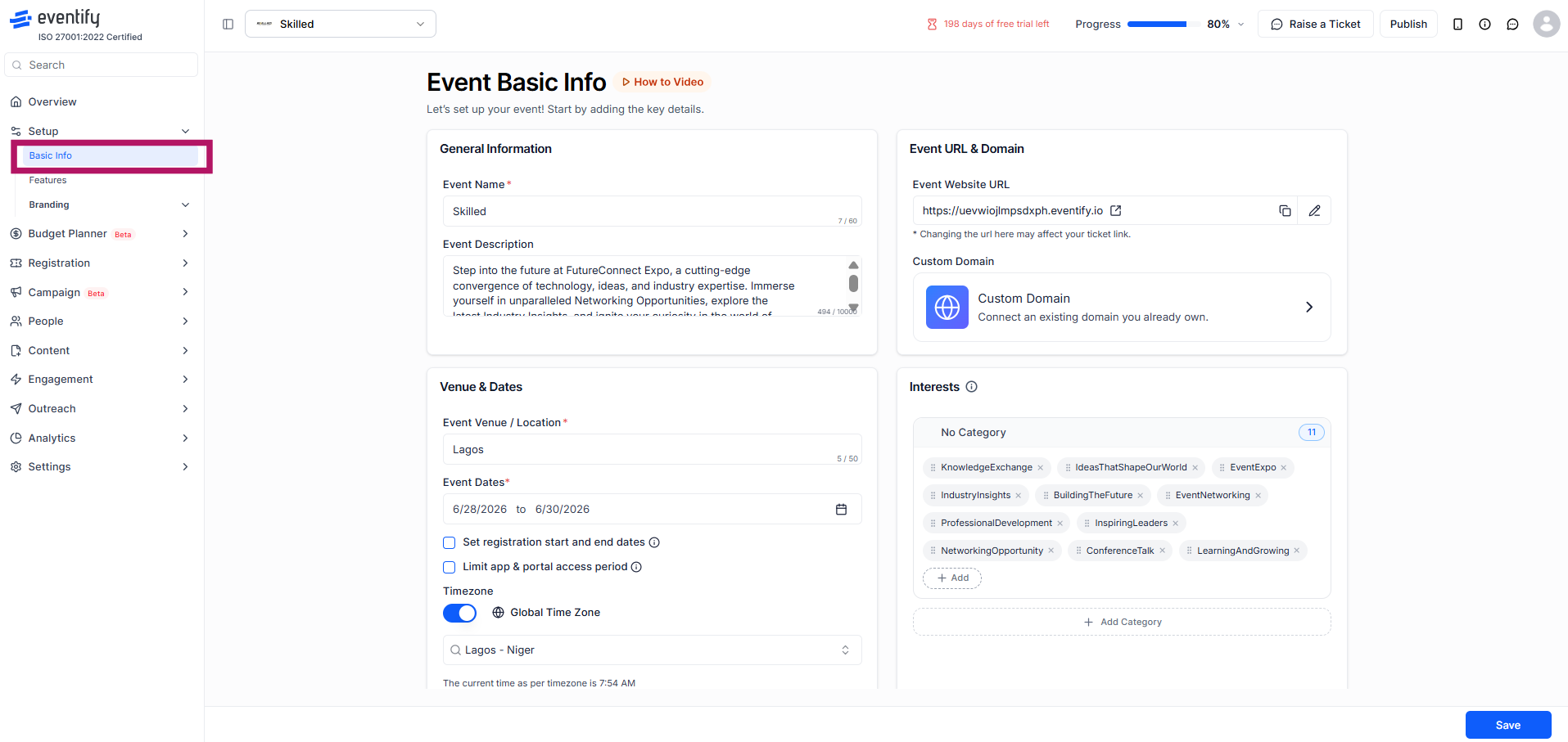
The Event Basic Info page has been reorganised for clarity. General information, venue and dates, event URL, and interest categories are now grouped into clearly defined panels, making it easier to complete setup in one focused session. The Interests section now shows your selected categories at a glance, with a cleaner add/remove interface.
The side menu now includes a built-in search bar, so you can find any section of the admin panel instantly without scrolling through the full navigation tree. Results surface in real time as you type.
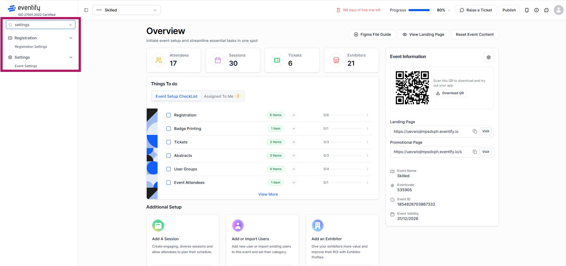
You can also pin your most-used sections to keep them visible at the top of the menu, and unpin them whenever your priorities shift.
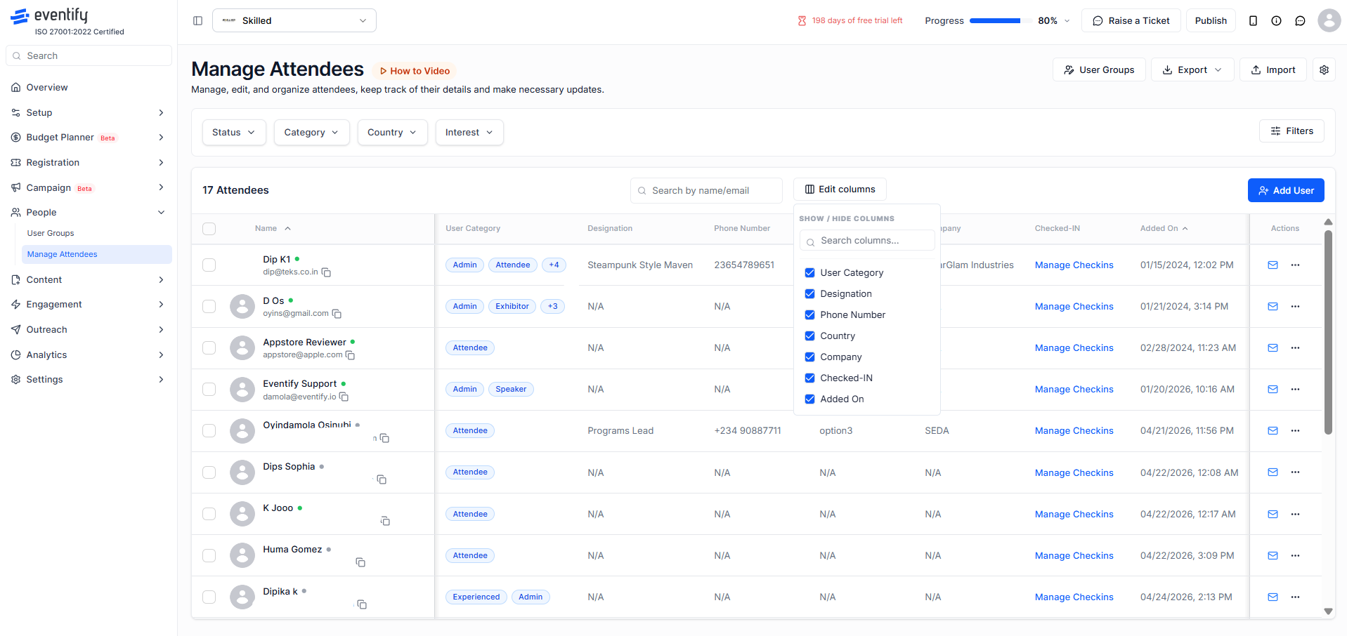
Finding the right attendees in a large event has never been more precise. The redesigned Manage Attendees screen now surfaces a wider range of filter options — including status, category, country, and interests — through clean dropdown filters at the top of the page. You can also customise exactly which columns appear in your attendee table using the Show/Hide Columns panel, toggling fields like designation, phone number, company, check-in status, and more on or off to suit your workflow.
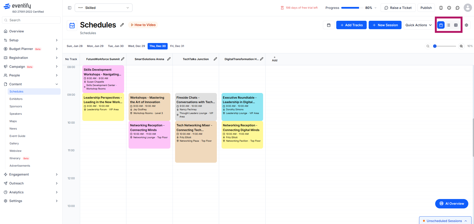
The Schedules section now offers three distinct viewing modes — calendar, list, and table — so you can manage sessions in whichever format works best for your workflow. The calendar view gives a visual overview of your programme by day and track. The list view organises sessions chronologically with speaker and location detail. The table view displays all sessions in a structured, sortable grid with editable columns.
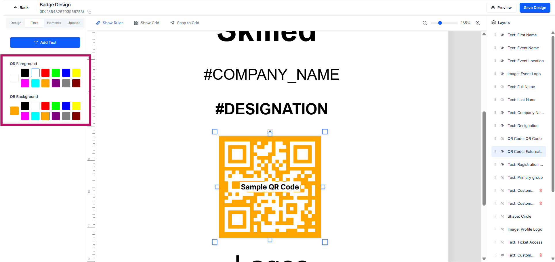
Badge design now extends to QR code styling. Organisers can customise the colour of QR codes on attendee badges to match their event branding, rather than defaulting to the standard black. This small but meaningful update gives your printed materials a more cohesive, professional finish.
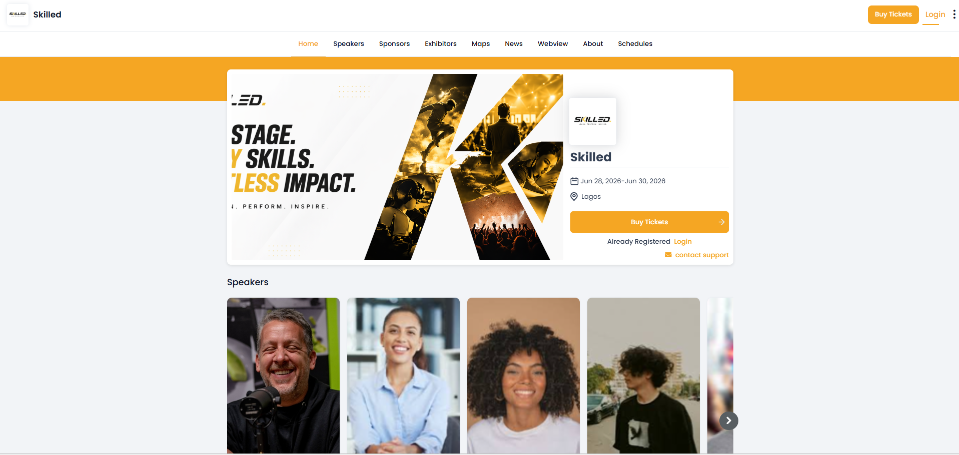
The attendee-facing event login page has been redesigned with a cleaner layout and stronger visual hierarchy. Your event branding, name, dates, and location are prominently displayed alongside the registration and login calls to action. The result is a more polished first impression for attendees arriving at your event portal.
Schedule a personalized demo.
See how Eventify can enhance the event experience for your attendees. Discover how mobile innovations are transforming events. Get a free demo tailored to your event objectives.
.png)


